3.17.2009

st. patrick's day, oh boy!

Instead of this....


I recommend recognizing this fine holiday by incorporating the following:


Avoid being pinched and substitute this dress for the green socks you've held on to for way too long.


Freshen up your bedroom with fresh accents and a new coat of Pear Green 2028-40 paint by Benjamin Moore.


Bring nature indoors, as Peter Dunham did with this fresh bathroom. I love his fabrics!


Discover your green thrumb and grow ivy on the facade on your less-than-thrilling apartment building.


Jot down your favorite destinations in this fabulous journal by my favorite stationary guru.


Put away the roll of papertowels (!!) and incorporate something a little festive (and southern) into your Powder Room with these.


Most importantly, no St. Patrick's Day is complete without enjoying a glass of Guinness. It may be a stout beer but it truely captures the essence of this fine day. Ladies (and gents), Chardonnay is not a substitute.


-Caitlin

3.15.2009

finger on the pulse

i am delighted by interaction between the many design genres, and often inspired by the fashion world in particular.  so, you can imagine my excitement when i discovered one of our latest upholstery projects to be on-trend with these spring/summer '09 images that i came across while torturing my inner (currently suppressed) shopping-addict this weekend.  thus, this riddle:  

what do you get when you combine...

kate moss rocking the versace resort ad campaign 


with these cutout flats by marc jacobs


with this brassy, glitzy, embellished ring by rings eclectic


with these flirtatious peep-toe pumps by alexander mcqueen?


the answer is... 

these newly upholstered channel-backed sweethearts in osborne & little fabric!  i know that hearts aren't for everyone but i think these little ladies are a winning combination of unabashed sweetness, subtle glamour, and just a little bit of sass.  i would love to see them in a room painted a warm, chalky grey with glossy red moldings, brass tables/accessories, our  'glamour girl' dresser, and a crystal chandelier.


oh, sweet validation!

-tyler

3.13.2009

proud partner

check out caitlin in this month's 7x7!

the chiavari

The Golden Chair.


Oh, the Chiavari. Such a little gem of a chair, isn't she? If you peruse 1st dibs, admire the work of 'the Wearstler', or love small scale jewelry-like seating, then my guess is that you are familiar with this lil' lady. In person, an authentic Chiavari is approximately 45" tall and a mere 15" wide. Its silhouette could be compared to a tall Kate Moss for she (the chair or the model) is lean, sinuous and owns a very small set of hips. Very small. Yet, because the chair stands high (and proud!), one often sees it balancing a seating area of upholstered furniture, or in front of a desk or vanity. Let's take a look at some of her glamour shots.

Starting off, Krista Ewart, a cool LA designer, placed a Chiavari chair in front of her dark French desk. Doesn't this look pretty? The chair's shape compliments the frenchiness of the table but also adds a golden delicacy to the scenario. I like.


Or in the image (below) of the Palm Spring's Trina Turk (designed by KWID).....I love how Ms. Chiavari stands her ground in front of the upholstered lounge chair and chaise. Just because she is narrow does not mean she will be swallowed up!


Something that you may be asking is how can one tell a true vintage Chiavari from an inexpensive party rental chair? Good question! Lets visually compare. The image below is a party rental chair version. Do you see how the back has a straight top and the frame style is more rectangular? Pretty, but something is missing.


Now, this lady below is the real deal. The first difference between the two chairs is the shape of the top of the back. Do you notice how the spindles of the back connect upward to a thicker rail that kind of flames up? That's my favorite part! Also, don't you agree that the vintage version has a more distinct leg? Observe how the leg is turned at the top and then tapers to a narrow diameter and then connects to a flat disk foot. The PR (party rental) version doesn't have that detail. Snoozy.


Something that might also have dawned on you is that most vintage Chiavari chairs are brass. This is true. Most are. But, some vintage versions are made of different materials. Currently at our shop, Found, we have a set of four walnut Chiavaris (with immaculate caned seats). They are unusual because most wood Chiavaris look like the party rental type. Not ours!


Something I learned when doing a little research for this entry is that not all Chiavaris have the same form. For example, study the image below. I have named this particular look as Mrs. Moustache. Love!


-Caitlin

3.12.2009

check out the hardware on this guy!

43.5"h x 19"d x 36"w; $625 SOLD

this vase reminds us of fergie, the duchess of york (or an '80's prom dress, depending on who you ask)


7"h x 4"w; $45 SOLD

designer to inspire: tom scheerer

one of the most frequent comments i've heard from our customers at found is, 'oooh, my grandparents had that very same [enter brass accessory here] in their house.'  sometimes the intonation suggests admiration, sometimes distaste (as if the smell of mothballs has suddenly invaded their sense memory), and sometimes confusion as to how/why this item could suddenly be current. it seems to me that such feelings are to be expected when shopping for vintage.  i LOVE hearing that good memories are being conjured and believe small doses of nostalgia to be healthy and inspiring, but i also want people to understand how mixing vintage pieces in unexpected ways can result in very fashionable, of-the-moment interiors.  there are many designers that have mastered 'the mix', but one who i think does this particularly well is tom scheerer.

see how he juxtaposes the curvaceous, curlicue bentwood chairs with the streamlined saarinen table, placed within a kitchen remodel?  it's exciting, right?


and again how a similar pair of chairs add interest as a graceful backdrop in the bedroom?  love it.


i'm kind of obsessed with his brooklyn townhouse project, where he again mixes time periods, purposes, and unexpected pairings to stimulating effect.  the mood is monochromatically serene, but made playful by small bursts of pattern.  i especially love the addition of the upholstered wingback to the dining area.  i mean, who doesn't feel like collapsing into a cozy chair at the end of a fatty meal?  and if you were looking for a quiet place to hide away and read a book, the dining room might be the last place where someone would try to find you.


here, in a bold display, a sense of history is created with a smattering (technical term) of pottery, flora and art within a lucite and louis-chair frame.  these elements might not seem like a natural match for one another, but the combination is delightful!


and, finally, the addition of mid-century brass lamps warms and glamourizes...


makes me excited to see what are certain to be unique, interesting, non-mothball-connotating future placements of these guys...


-tyler

3.11.2009

one tall drink of water!


7.75"w x 10.5"h; $75 SOLD

brass candleholder for the bold & beautiful


10.5"w x 6"h; $50

versatile little server for your next soiree


11.25"w x 1.75"h; $25 SOLD

3.10.2009

painted potted pretties


14" x 11"; $95

butter dishes: not just for butter anymore


7" x 4.5"; $35

brass filigree mirrored tray from the vanity of elvira hancock


18" x 12" x 1.5"; $130

19th c wallpaper roll lamp w/brass inlay... wow!


7"d x 36"h; $650

Books. Books. Books.


Lately, I have been paying attention to bookcases. You see, I love books. I love looking at them, sometimes even more than even reading them (dependent on genre). It is interesting to me to see how varied the approaches are in displaying one's collection. As a decorator, I am often asked to help clients arrange their bookshelves to achieve a more stylized look. I love this task but I recognize that my method is different than others. There are many wonderful ways to go about showcasing your collection. It is entirely up to you. I prefer to see things a little more 'un-designed', as if you finished a book and put it on your shelf and then moved on. I recognize one runs the risk of the books looking a little disorganized or cluttered but I guess I like that risk. I like it to (hopefully) feel like someone is really reading those books, not just looking at them.


Like so.


Or this image. I especially love stacks of books, like beneath the miniature topiary.


I'm often asked how one should go about including objects into their bookcases. My answer is to think about what you are displaying and why. Round objects look great adjacent to a leaning wall of books, like say a ceramic vase. This one is from our shop and adds great dimension to your collection of books.


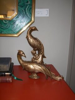
Another idea is to introduce unusual shapes into your arrangement of books. These feathered beauties are a nice juxtaposition to the rectangular shape of books, offering up some curves and softness to the linear-ity (is that a word?) of a standard bookcase. These birds are also available at Found.


Below is a lovely installation of books and rustic objects by designer, Victoria Hagan. Notice how she has selected books that have a worn feel to coordinate with the aged finishes of the sculpture and boxes. She has also grouped the books and objects by color (more about that in a moment).


Another way to commence the book arranging process, is to group your spines by color and arrange them accordingly. I think this is a very interesting process, not only because the end product gives you a kaleidescopic library but it can be cool to see what books end up next to one another. Judy Blume adjacent to Steinbeck.....the irony!


This bookcase is arranged by color but it's messiness (that is a compliment!) allows it to feel approachable. I like!


Or like our friend and fellow designer, Chloe Warner, demonstrates with the book arrangements in her own home, color coding can be serene. Serene-ly organized!


What do you like? How do you arrange your books? Do tell.
-Caitlin

3.05.2009

from the estate of mr. miyagi


8" x 8"; $110 SOLD